ShopDreamUp AI ArtDreamUp
Deviation Actions


Suggested Deviants


Suggested Collections


![SMITE - [Community Collab] Thor](https://images-wixmp-ed30a86b8c4ca887773594c2.wixmp.com/f/1f62715f-4d7f-4555-bea5-edcca9c29855/daf34jt-2fd7e7dd-bc0f-4ea0-934c-1ac70dca05e4.png/v1/crop/w_184,h_184,x_0,y_20,scl_0.1752380952381/smite____community_collab__thor_by_dante_aran_daf34jt-92s-2x.png?token=eyJ0eXAiOiJKV1QiLCJhbGciOiJIUzI1NiJ9.eyJzdWIiOiJ1cm46YXBwOjdlMGQxODg5ODIyNjQzNzNhNWYwZDQxNWVhMGQyNmUwIiwiaXNzIjoidXJuOmFwcDo3ZTBkMTg4OTgyMjY0MzczYTVmMGQ0MTVlYTBkMjZlMCIsIm9iaiI6W1t7ImhlaWdodCI6Ijw9MTQ2MyIsInBhdGgiOiJcL2ZcLzFmNjI3MTVmLTRkN2YtNDU1NS1iZWE1LWVkY2NhOWMyOTg1NVwvZGFmMzRqdC0yZmQ3ZTdkZC1iYzBmLTRlYTAtOTM0Yy0xYWM3MGRjYTA1ZTQucG5nIiwid2lkdGgiOiI8PTEwMjQifV1dLCJhdWQiOlsidXJuOnNlcnZpY2U6aW1hZ2Uub3BlcmF0aW9ucyJdfQ.II_ZeM3wBX3APKttuyhiljnBRN4dKdJv18lbDBMfWgc)
![SMITE - [Community Collab] Thor](https://images-wixmp-ed30a86b8c4ca887773594c2.wixmp.com/f/1f62715f-4d7f-4555-bea5-edcca9c29855/daf34jt-2fd7e7dd-bc0f-4ea0-934c-1ac70dca05e4.png/v1/crop/w_92,h_92,x_0,y_10,scl_0.087619047619048/smite____community_collab__thor_by_dante_aran_daf34jt-92s.png?token=eyJ0eXAiOiJKV1QiLCJhbGciOiJIUzI1NiJ9.eyJzdWIiOiJ1cm46YXBwOjdlMGQxODg5ODIyNjQzNzNhNWYwZDQxNWVhMGQyNmUwIiwiaXNzIjoidXJuOmFwcDo3ZTBkMTg4OTgyMjY0MzczYTVmMGQ0MTVlYTBkMjZlMCIsIm9iaiI6W1t7ImhlaWdodCI6Ijw9MTQ2MyIsInBhdGgiOiJcL2ZcLzFmNjI3MTVmLTRkN2YtNDU1NS1iZWE1LWVkY2NhOWMyOTg1NVwvZGFmMzRqdC0yZmQ3ZTdkZC1iYzBmLTRlYTAtOTM0Yy0xYWM3MGRjYTA1ZTQucG5nIiwid2lkdGgiOiI8PTEwMjQifV1dLCJhdWQiOlsidXJuOnNlcnZpY2U6aW1hZ2Uub3BlcmF0aW9ucyJdfQ.II_ZeM3wBX3APKttuyhiljnBRN4dKdJv18lbDBMfWgc)


Description
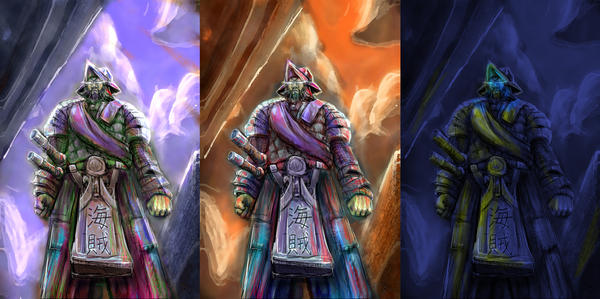
Instead of doing my speedpainting for the day I decided to flesh this one out and demonstrate what I know on color scemes based on time of day. Tell me what u think?
Photoshop, total paint time 9 hours
Photoshop, total paint time 9 hours
Image size
2301x1143px 1.96 MB
© 2007 - 2024 LordJay
Comments10
Join the community to add your comment. Already a deviant? Log In
This is certainly an ambitious painting. The idea of trying to predict the interactions with the colors of light at specific times of day is a good one. I am not entirely sure if your study is entirely successful, however.
Firstly, there are some problems with the figure itself. Although exaggerating proportions can be a handy tool in many cases, this character seems to be clearly human, and the proportions do not look knowingly exaggerated. Each of the arms is a different length, and the elbow in the character's right arm seems much too high up. I am not entirely sure what it happening with the character's hat, but relative to the head, it looks twisted to the side, which is thrown off by the fact that the face is depicted facing entirely forward. The figure's armor appears at a glance to be ornate, with heavy japanese influence, but the handling of the details and lines suggests to me that the ambiguity of the detail was not a concious decision. Did you use references for the armor, or did you try to fabricate it? Reference photos become very beneficial, even when depicting something that does not necessarily exist.
Secondly is the color scheme. Although the colors are certainly vivid and varied between each study, it seems that you may not have decided on an actual neutral-light color scheme before beginning this study. If the first is supposed to be a reference point, then it would make little sense that the figure in the second panel has so much blue in its skirt/pants. The extra vivid spots of color, specifically the greens and reds in the skin tones of each piece are distracting, and probably not beneficial. Buy a variety of colored lights, and use them to light a board that you have painted with several different colors to see how the colors interact with each other under different lighting conditions. You may find this to be very useful.
Lastly, there are some lighting issues. None of the pieces seem to have a clear source of illumination. This is especially evident in the last panel -- it is not entirely clear where the odd yellow-green light is coming from, and it's simply distracting. You appear to have a vague understanding of the overall form of the figure, but the way that the shadows and shading are handled suggests that there is only that vague understanding, resulting in a rather flat, formless figure. If you were able to observe, perhaps, action figures or other photos, you may be able to push the three-dimensionality of these figures and make the piece much more dramatic and effective.
While this piece is quite ambitious, and I applaud you for it, I say as objectively as possible that it may benefit you to take a step back and review some of the basics, and cut back slightly on the ambition before you try to take too many steps forward. Best of luck to you. (Smile)")
Firstly, there are some problems with the figure itself. Although exaggerating proportions can be a handy tool in many cases, this character seems to be clearly human, and the proportions do not look knowingly exaggerated. Each of the arms is a different length, and the elbow in the character's right arm seems much too high up. I am not entirely sure what it happening with the character's hat, but relative to the head, it looks twisted to the side, which is thrown off by the fact that the face is depicted facing entirely forward. The figure's armor appears at a glance to be ornate, with heavy japanese influence, but the handling of the details and lines suggests to me that the ambiguity of the detail was not a concious decision. Did you use references for the armor, or did you try to fabricate it? Reference photos become very beneficial, even when depicting something that does not necessarily exist.
Secondly is the color scheme. Although the colors are certainly vivid and varied between each study, it seems that you may not have decided on an actual neutral-light color scheme before beginning this study. If the first is supposed to be a reference point, then it would make little sense that the figure in the second panel has so much blue in its skirt/pants. The extra vivid spots of color, specifically the greens and reds in the skin tones of each piece are distracting, and probably not beneficial. Buy a variety of colored lights, and use them to light a board that you have painted with several different colors to see how the colors interact with each other under different lighting conditions. You may find this to be very useful.
Lastly, there are some lighting issues. None of the pieces seem to have a clear source of illumination. This is especially evident in the last panel -- it is not entirely clear where the odd yellow-green light is coming from, and it's simply distracting. You appear to have a vague understanding of the overall form of the figure, but the way that the shadows and shading are handled suggests that there is only that vague understanding, resulting in a rather flat, formless figure. If you were able to observe, perhaps, action figures or other photos, you may be able to push the three-dimensionality of these figures and make the piece much more dramatic and effective.
While this piece is quite ambitious, and I applaud you for it, I say as objectively as possible that it may benefit you to take a step back and review some of the basics, and cut back slightly on the ambition before you try to take too many steps forward. Best of luck to you.